
Identity / Marketing materials
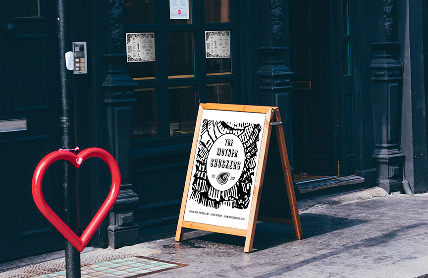
The Mother Shuckers are a two-person team of mobile oyster mixologists who host experimental oyster events around London.
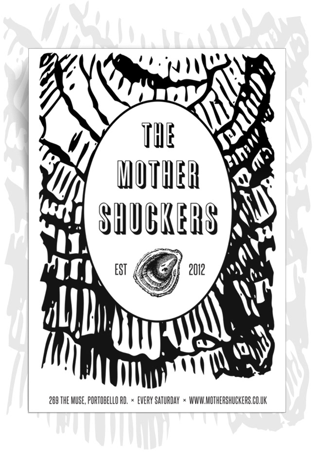
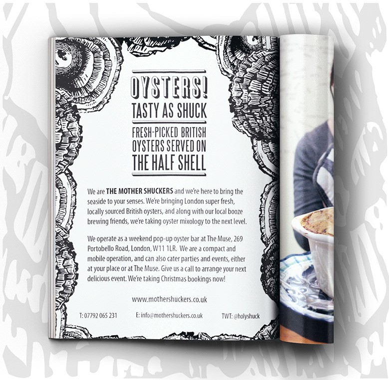
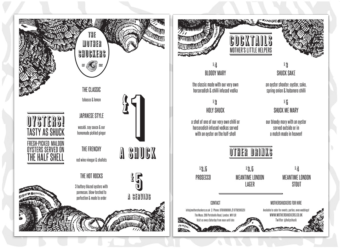
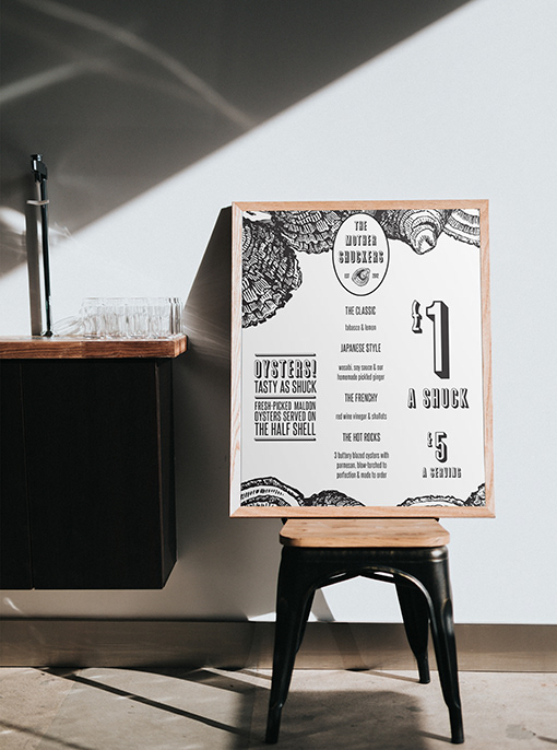
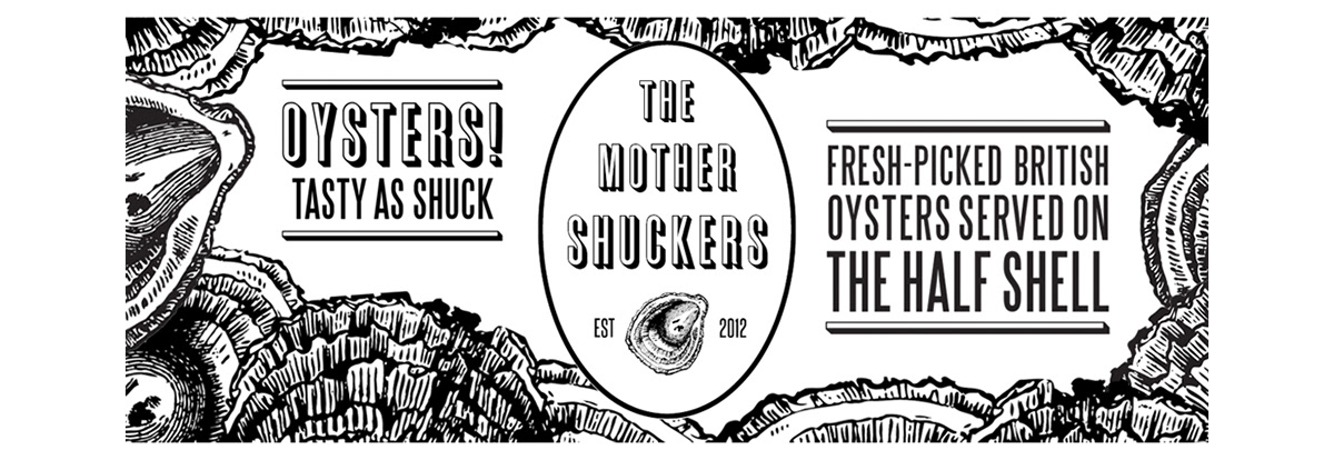
The pair needed identity graphics and marketing materials for their launch event. They wanted to convey a modern, daring company that were shaking things up in the culinary pop-up scene. We developed the brand aesthetic around the natural topographical line texture of the oyster shell. The base graphics were taken from a 19th-century woodcut of oyster shells, which could serve multiple uses; as stand-alone illustrations, as patterns and as backgrounds. The brash, cheekiness of the brand shone through the copy, playing on the "shuck" pun of their company name.
We intentionally limited all of the identity graphics to black and white. The aesthetic intention was to heighten that loud contrast of line and shape, and reference the oyster colours. There was a bonus economic benefit too; keeping printing costs down for the start-up by limiting it to one print colour. As material costs were a base concern, we based the format of the printed menu around being able to print four copies to each double-sided A4 sheet.
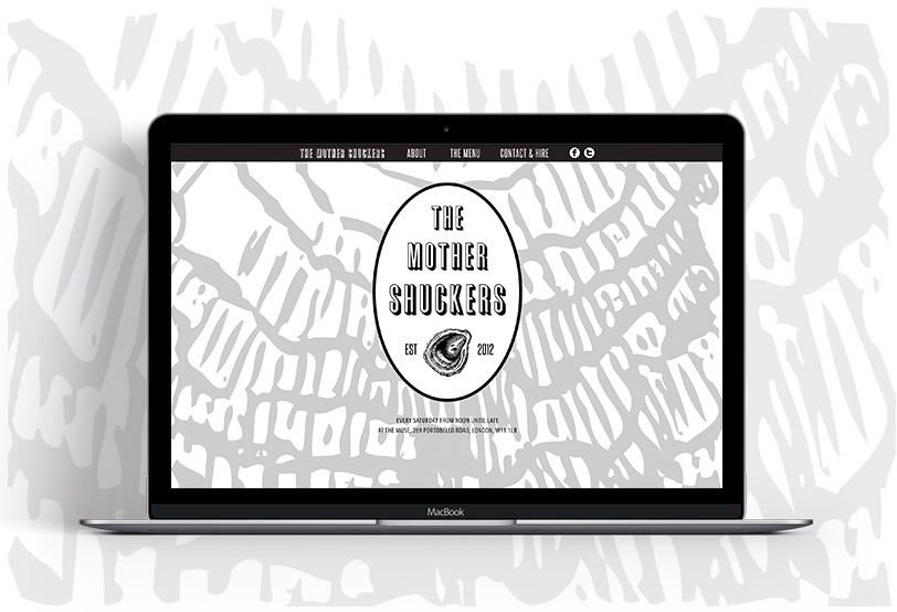
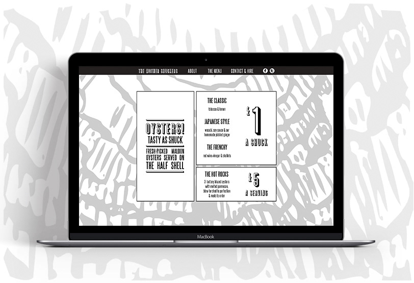
As well as menus, poster and advertising, we put together a minimalist website with the same bold, boxy menu graphic floating on an oyster pattern background.